In this blog post, we will be discussing a UX design challenge that I encountered while working on small ReactJS application at work and pertaining design considerations.
TL;DR: The post discusses UX designs that were considered progressively so as to come up with a reasonably intuitive UX design to express many-to-many realtionships in UI. The github repository of the ReactJS application that implements the final design that we settle at can be found here.
Let's understand the problem first!
Requirement
As already discussed in my last post, as part of moving our platform from monolithic to microservices architecture, we decided to use Consul for service registration and discovery.
Adding to this requirement, our management was also expecting a portal from where they can get a high level view of the underlying deployment model. Although, Consul itself provides a decent UI for the same but it was lacking to express certain relationships and answer certain business questions that are mandatory to make important decisions.
This could be blamed onto the peculiar deployment model that we follow. Our services when deployed on a node are commisioned for a list of customers. These service to customer relationships are defined in the service configuration itself. However what's important to understand here is that services could be deployed on different nodes for different customers thereby resulting in establishment of intricate many-to-many relationships between nodes, services and customers. Although, Consul has Services and Nodes defined as native concepts, it doesn't have a concept like Customer thereby failing to express these relationships in totality and answer questions important for decision making by management, such as:
- Given a node, which services are deployed on that node and for which customers each service is commisioned for?
- Given a service, which nodes this service is deployed on and for which customers it is commisioned for on those nodes?
- Given a customer, which services are commisioned for this customer and on which nodes?
This clearly leaves us to a UX design challenge to express these relationships in UI so as to answer important business questions.
Before moving to design considerations, I would also like to bring to reader's attention that the solution also involves including the list of customers a service is commisioned for when deployed on a certain node as tags in the Consul service definition while registering the service to Consul for discovery. This allows the app (the portal) to fetch many-to-many relationships right from Consul itself instead of service's configuration file thereby saving an unnecessary indirection and effort!
Design Considerations
Starting to think of a design, we need to first make sure if the expectations from our app are set right, saving ourselves efforts burnt in redefining our expectations and subsequent design reiterations. Revisting requirements, we realise that the questions that the management is seeking answers for are the only expectations from our app. Though these questions might seem very similar but we will see how they shape our UX design.
Since we are talking about expressing many-to-many relationships in UI, we of course don't want all these relationships expressed all at once in the UI and let the user go figure the answers to his questions. That would make it overwhelming and non-intuitive. Instead the app should facilitate the user to seek answers on demand either by allowing the user to navigate through these relationships in some way or by making it searchable.
In our pursuit to come up with a reasonbly intuitive UX to express many-to-many relationships in UI we considered following 3 designs, addressing shortcomings from former designs in subsequent designs.
1. Word Match
One of the ways we can express many-to-many relationships in UX is what we all are apparently familiar with as Word Matching. Wherein, we relate items in a column to items in another via pointed arrows to express the relationship between those items.
This is one of the simplest model to express many-to-many relationships. However, as we explore this approach further, we will see how it fails to answer business questions in an intuitive way.
Let's first see how we can express many-to-many relationships when only nodes and services are involved. When a user selects one of the nodes, say Node A, all the services i.e., Service A, Service B and Service D that are provisioned in that node are highlighted to express node to service relationship.

Similarly, service to node relationship can be expressed when the user first selects a service. All the nodes in which Service B was provisioned get highlighted, namely Node A and Node B. The order in which the nodes are selected suggests the direction in which user has explored the relationship.

So far everything seem okay. However, as we introduce customers to the equation, the expression starts to become non-intuitive. Let's say user first selects Node A to highlight provisioned services i.e., Service A, Service B and Service D, and then as a next step selects Service D to reveal and highlight all the customers the service was commisioned for. Clearly, the order in which nodes, services and customers were selected or the direction in which these relationships were explored becomes difficult to figure out.

You can find yourself in similar issue when started from service.

And the order of selection is completely lost when the relationship is one-to-one.

Also, we could see how this model fails to scale when the number of nodes, services and customers are on the rise.
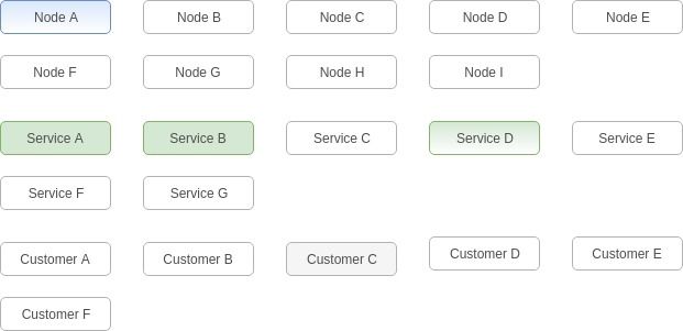
And more so when the number of categories are added to the equation.
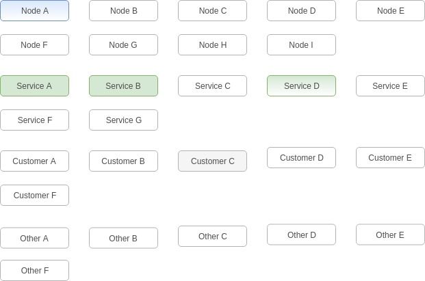
Let's see if we can do better than this!
2. Cartesian Product
In set theory, for sets A and B, the cartesian product is defined as the set of all ordered pairs (a, b) where a ∈ A and b ∈ B.
A X B = {(a,b) | a ∈ A and b ∈ B}
If we consider Nodes, Services and Customers as sets, we can come up with a similar set of all such ordered pairs, like so.
Nodes X Services X Customers = {(node, service, customer) | node ∈ Nodes, service ∈ Services and customer ∈ Cutomers}
The resulting cartesian product can be expressed in UI in a tabular form like so.
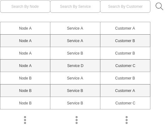
Clearly, the cartesian product may result in a huge list of such ordered pairs. This in IMO may never be an issue if user can filter the list based on nodes, services and customers.
Node based filtering to answer question: Given a node, which services are deployed on that node and for which customers each service is commisioned for?
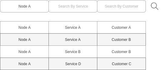
Service based filtering to answer question: Given a service, which nodes this service is deployed on and for which customers it is commisioned for on those nodes?
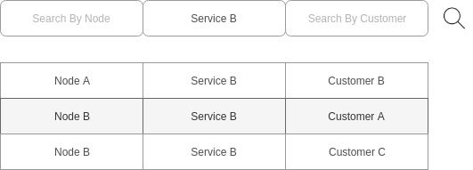
And Customer based filtering to answer question: Given a customer, which services are commisioned for this customer and on which nodes?
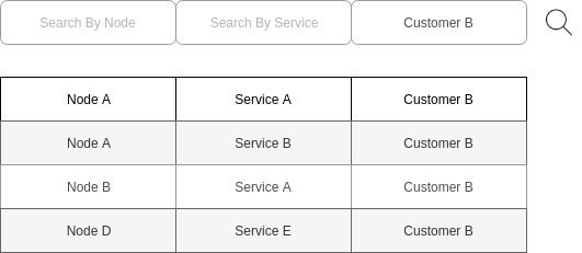
And of course user can apply all the filters at a given time to narrow down his search.

Compared to previous model this expression clearly scales well. No matter how huge the set of nodes, services and customers are, the ordered pairs can always be filtered to what matters to user.
One of the drawbacks of this approach however is that it is always filter driven! This requires user to be well versed with the names of nodes, services and customer to drive the filter, if not the relationships between them.
3. Tree

Coming to our final design, the tree model allows the user to traverse the tree unlike any other model.
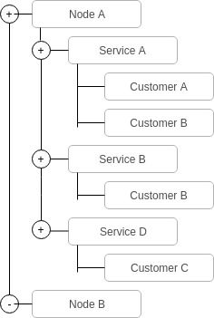
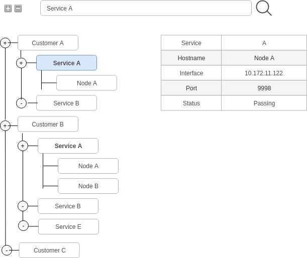
This model could also be presented in different views to express the relationships between nodes, services and customers from different perspectives thereby answering each of the questions management is seeking answers for as intuitive as possible. In particular, we can have three different views, such as, node view, service view and customer view to serve our purpose.
Node view to answer question: Given a node, which services are deployed on that node and for which customers each service is commisioned for?

Service view to answer question: Given a service, which nodes this service is deployed on and for which customers it is commisioned for on those nodes?
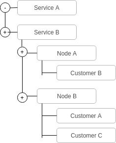
And Customer view to answer question: Given a customer, which services are commisioned for this customer and on which nodes?
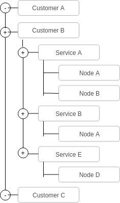
Besides tree traversal and custom views, this model can also be supplemented with simple textual search, expand-collapse all and info table to add to the intuitiveness.
Conclusion
The most reasonable model that seem to overcome the shortcomings of former models is undoubtedly the Tree model. By providing different views, the design not only makes the model highly scalable but also facililates user to find answers to all of his questions in the most intuitive way.
Settling to the tree model, I have infact built a small reactjs application to demonstrate the same. You can find the project on github.
That's all for this post. Hope you enjoyed to explore the thinking that went behind these UX design considerations.